Fix Your F**king UI

It's 2005, you just got your first MySpace account, your friend sent you a snippet of web 2.0 CSS that you copy-pasted to make your profile look fucking wacky, it looks like a big hot mess but fuck-yeh, you just wrote some code and the web is all about freedom of expression.

Yeh right, it's 2023, the web is dominated by Silicon Valley tech-crunch-nut-f*ck-orgazoid investment seeders, and your UI/UX consultant is telling you your CSS is whack. And you know what? It really is!
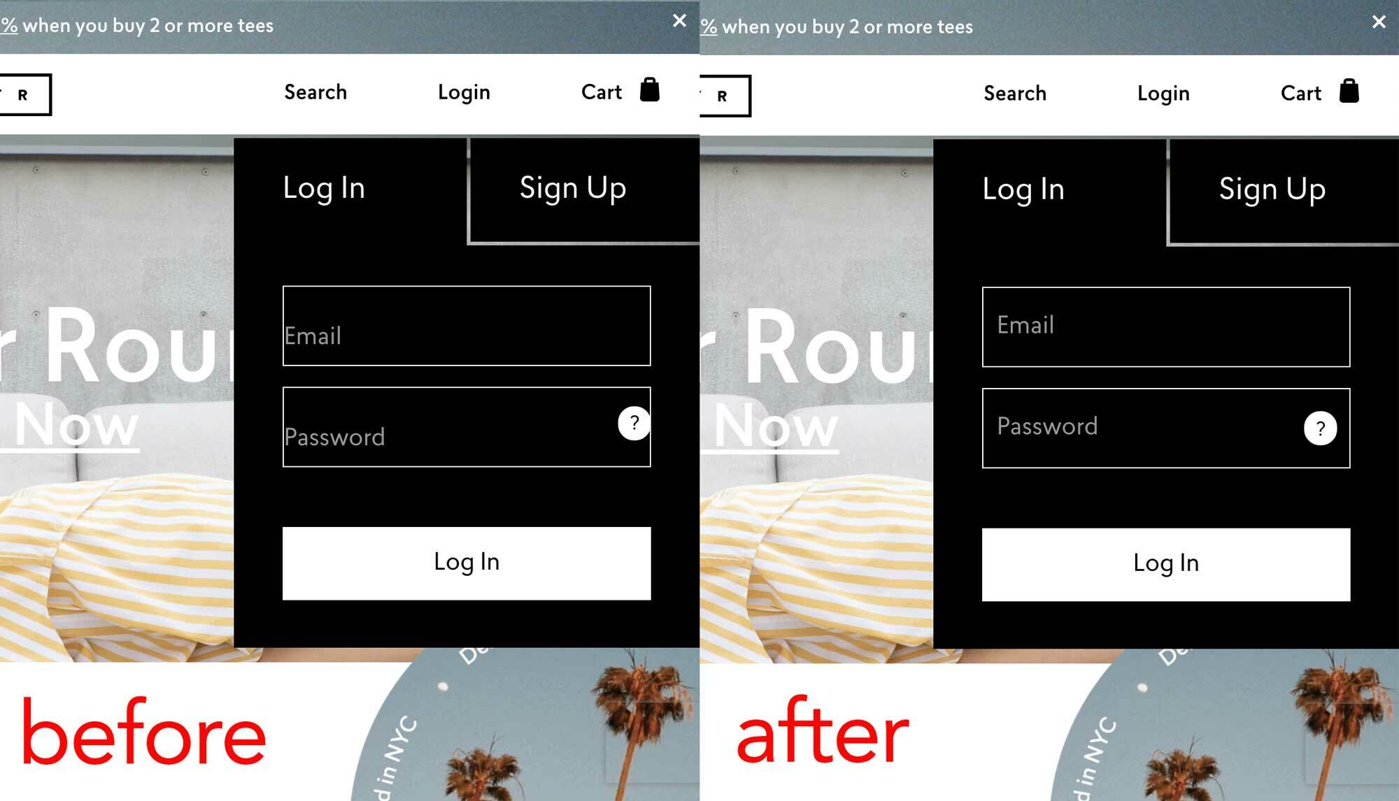
If you want to instill the utmost confidence in your customers, you'd better make your UI experience the absolute best-in-class.


Don't tell me your story about how you just secured stage 3 tech-crunch-nut-f*ck-orgazoid seed funding, but you're expecting your users to login on your janky ass "I just made a MySpace page" system. Sort out your UI.

I took my inspiration from the one and only Ben Sherman when I said "looking good (online) isn't important, it's everything". If you want to instill the utmost confidence in your customers, you'd better make your UI experience the absolute best-in-class.

Ayr Shopify Website
AYR.COM From this janky looking shit, to this, in less than a minute. Hire a UI expert, not a code monkey.

If you just secured stage 3 tech-crunch-nut-f*ck-orgazoid seed funding then guess what, your web developer just bought a house next to Molly Ringwald in the San Fernando Valley -- "where all good taste goes to die", along with your UI.

So pretty please, with sugar on top, fix your fucking UI.