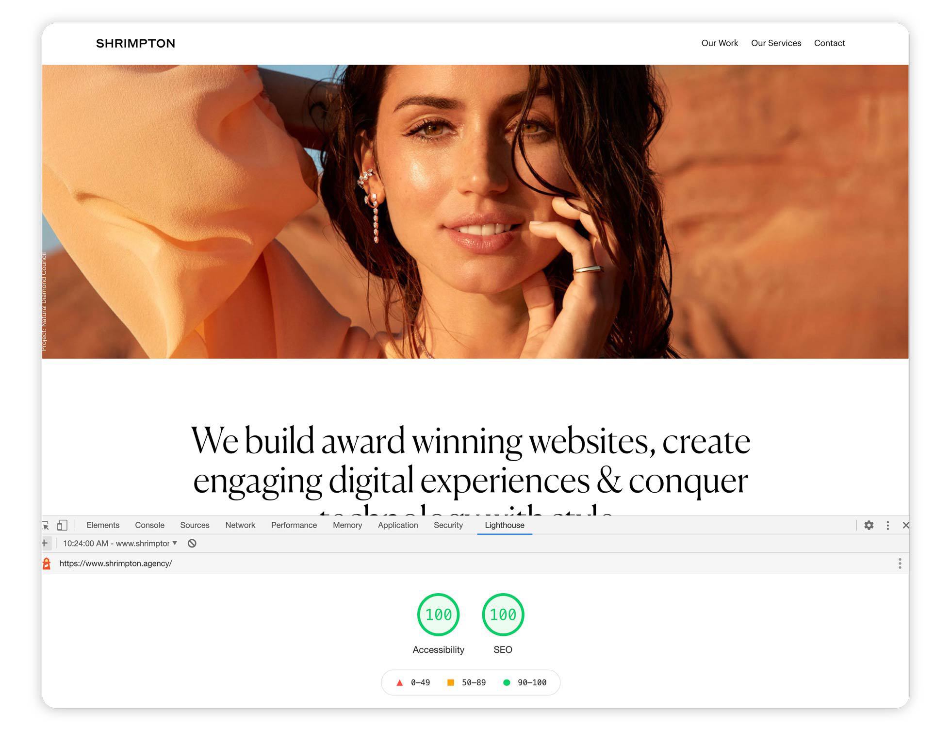
Achieving 100% ADA Lighthouse score

The process needs to begin at the design stages of a website -- if you're designing with tiny 9px font sizes, in shades of the lightest gray, your doing it wrong from the start.

As a UI/UX designer, font size & contrast ratio is the easiest place to start, you can use this contrast checker tool to continually test your ratios.

Although a recommended font size of 12px is advised, remember, font's with a proportionately small X height, like Futura, read smaller than screen favorite Georgia, with its very large X height.
If you're designing with tiny 9px font sizes, in shades of the lightest gray, you're doing it wrong from the start.

Achieving 100% ADA Lighthouse score

As a developer, the easiest way to start auditing your sites is to use the Google Chrome Lighthouse extension. This will report all DOM elements that fail, and you can begin fixing them right way.

A 100% Lighthouse score is only the start, but its a great base line. You should reference the W3C Guidelines on accessibility to continue to make improvements. Ultimately, accessibility relies strongly on thoroughly semantic DOM structure and UI and is not merely code tweaking, if you've been designing or developing websites however you saw fit, now is the time to start changing those bad habits.