
The Wackiest UIs on Shopify — it all feels like 2004 and Flash is back

Now that HTML5 standards are truly mature, the web is once again becoming a playground for wacky, anything goes UI.
Shopify themes, contrary to popular belief, can be a blank canvas where anything is possible. Using your favorite Javascript frameworks and libraries alongside your semantic liquid code with a bundler like Webpack or Vite JS has never been easier. But with this new wackiness comes a new challenge — whereas in 2004 nobody making Flash sites ever envisaged they could possibly sell a product there, Shopify Themes are there to do one thing well, make path-to-purchase paramount, and along with that comes accessibility, SEO and performance considerations...
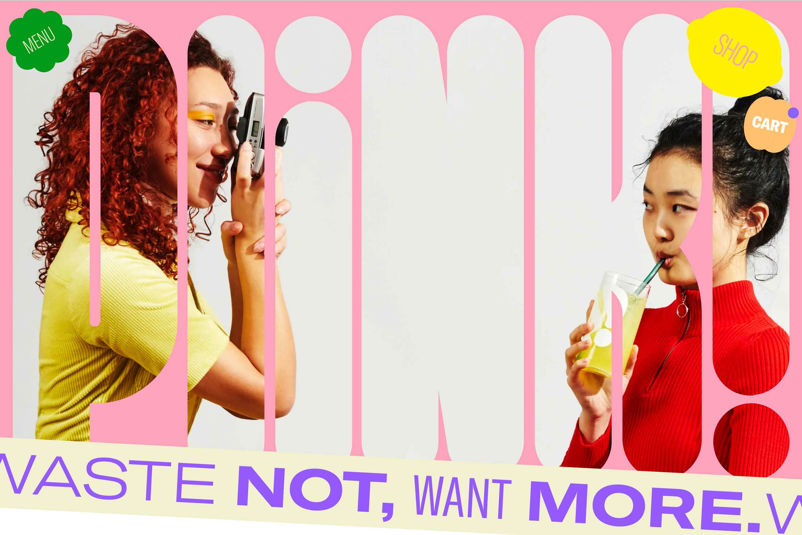
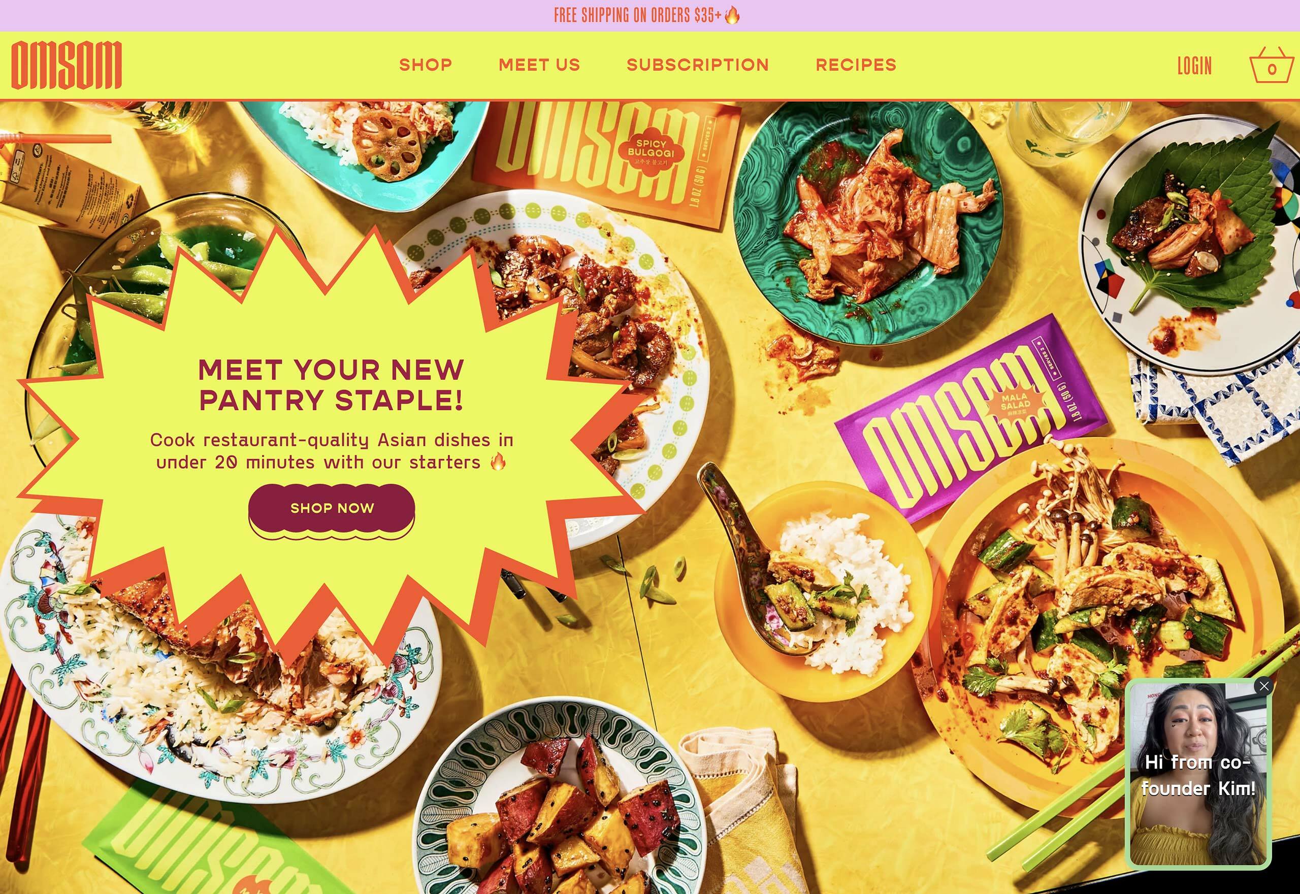
Bouncing lemons, massive knockout text, animated SVGs, bi-directional diagonal marquees, cursor icons, vertical text — it all feels like 2004 and Flash is back.
